Web design is a space where users interact, and colors form an important part of design. Colors play an important role in how you make your website users feel. Choosing the right color can lead users to emotionally connect, stay on your site longer, and even lead to customer loyalty. In this article, you can learn more about color selection and its psychological effects in web design.
-
- What is Color Psychology?: Color psychology is a field that studies the psychological effects of colors on people. Colors are known to evoke certain emotions on people. For example, the color blue has a calming effect, while the color red is exciting.
-
-
- Color Selection in Web Design: Color selection in web design is an important factor that determines the look and feel of your website. Appropriate use of colors can reflect a website’s purpose, audience, and values. It can also be used to create the right emotional impact on users.
- Psychological Effects of Colors: Below you can learn about the psychological effects of the most frequently used colors in web design on people: Red: It evokes excitement, passion and energy. In addition, it is a striking color and increases mobility. Blue: Gives a feeling of calmness, confidence and reliability. It also represents professionalism and a thoughtful approach.
Green: It gives a feeling of nature, health and peace. In addition, it evokes a feeling of vitality and freshness.
- Color Harmonies: The combination of colors can be made more effective by creating an appropriate harmony.
-
Color selection in web design plays an important role in determining the message your website will give to its users. Appropriate use of colors can make users more interested and emotionally connected to your site. Therefore, when choosing colors, it is recommended to consider the characteristics of your target audience, the purpose and values of your website.
What is Color Psychology?
Color psychology is a field that studies the psychological effects of colors on people. Colors affect people’s emotions, behavior and mental processes. The psychological effects of colors affect people’s reactions to their environment and the emotions they feel. For example, the color red evokes excitement and passion, while the color blue gives a feeling of calmness and confidence. The psychological effects of colors are used in many industries, especially in areas such as marketing and advertising, to influence people’s purchasing decisions. The psychological effects of colors are also considered in many areas such as web design, logo design, packaging design, interior design.
Color Selection in Web Design
Color selection in web design is the process of choosing and using colors used to determine the look and feel of a website. Colors play an important role in the sensory design of the website, and when used correctly, they help convey the right emotion and message for the website. Colors also have an impact on the readability, usability and brand image of the website.
The use of colors can help you reflect the purpose of your website, your audience, and your values. For example, while blue is preferred for a calm and professional look, red or orange colors can be used for a lively and striking look.
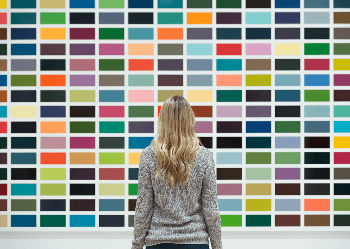
Colors can also be used to create the right emotional impact on users. Colors are a factor known to evoke certain emotions in people. For example, the color orange evokes feelings of happiness, energy and joy, while the color red is exciting.
When choosing colors, the purpose of the website, its target audience, values and brand image should be considered. In addition, design principles such as contrast, gradation and color wheel should be considered. Choosing the right color can help users feel committed to your website and stay on your site longer.
Psychological Effects of Colors
Colors are a powerful tool that influences people’s mental and emotional states. The psychological effects of colors refer to the emotional reactions individuals feel when they see a color. Colors can affect people’s thoughts, feelings and behaviors, and therefore color selection is extremely important in web design.
Below is a summary of the psychological effects of the most common colors on people:
• Red: Red is a striking and energetic color. It evokes emotions such as excitement, passion and activity. Red can also be a warning, such as danger or emergency.
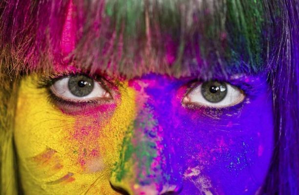
• Blue: The color blue evokes a feeling of calmness, confidence and reliability. It also represents professionalism and a thoughtful approach. Therefore, the color blue is often used on the websites of businesses and financial institutions.
• Green: Green color gives a feeling of nature, health and peace. In addition, it evokes a feeling of vitality and freshness. It is frequently used in the marketing of green, natural and organic products.
• Yellow: The color yellow gives a feeling of happiness, energy and optimism. It is also a striking and vibrant color. The color yellow is often used for emphasis in web design.
• Purple: Purple color gives a feeling of luxury, wealth and creativity. It also creates an atmosphere of mystery and sophistication. Therefore, the color purple is often used on the websites of luxury brands.
• Orange: The color orange gives a feeling of warmth, activity and joy. It is also a striking and vibrant color. Orange color is often used in the marketing of active and energetic products.
• Pink: Pink color gives a feeling of romance, femininity and compassion. It also evokes a feeling of innocence and warmth. Pink color is often used in the marketing of cosmetics and women’s products.
• Brown: Brown color evokes a feeling of naturalness, confidence and simplicity. It also gives a sense of solidity and grounding. The color brown is often used in the marketing of organic products and on the websites of natural, organic brands.
In addition to these colors, each color can be used in different tones and shades, which can create different psychological effects. For example, dark blue creates a more professional and reliable feel, while light blue creates a calmer and more peaceful atmosphere.
When choosing colors in web design, you should consider your target audience and the personality of your brand. For example, a brand with a fun and youthful audience might prefer vibrant colors like orange or yellow. However, for a more serious and professional brand, calmer colors like blue or green may be more appropriate.
As a result, the psychological effects of colors are very important in web design. Choosing the right color can help reflect your brand’s personality and target audience and evoke positive emotions and reactions from your website visitors.
Color Matches
Color harmony is the use of harmonious or contrasting colors together. Color harmonies in web design contribute to the overall appearance of the site and can give different emotional effects to site visitors. Here are the commonly used color combinations in web design:
Monokromatik Uyum: Monokromatik uyum, aynı renk tonunun farklı tonlarının bir arada kullanımını ifade eder. For example, shades of blue can be used together. This harmony creates a calm, relaxing and minimalist effect.
Complementary Harmony: Complementary harmony refers to the use of colors that are directly opposite each other on the color wheel. For example, red and green, blue and orange. This harmony creates a high-contrast effect and can be eye-catching.
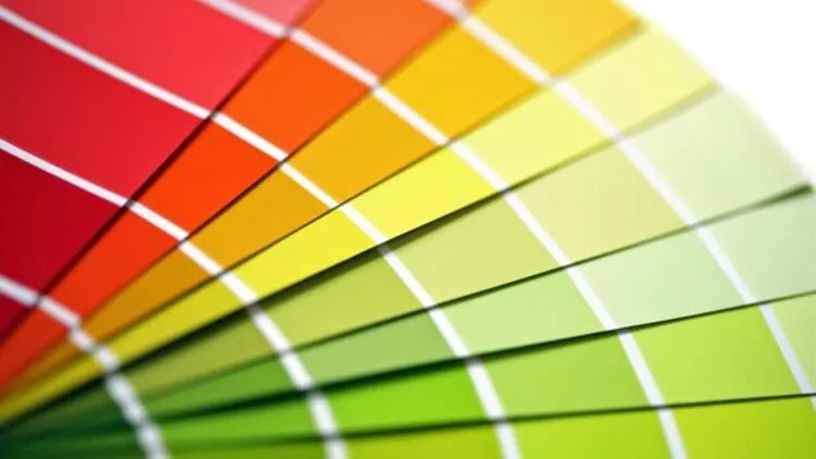
Analog Harmony: Analog harmony refers to the use of color tones that are close to each other on the color wheel. For example, blue, blue green and green can be used together. This harmony creates a harmonious and warm effect.
Triadic Harmony: Triadic harmony refers to the use of three equally spaced hues on the color wheel. For example, yellow, red and blue can be used together. This harmony creates a lively, dynamic and remarkable effect.
Split-Complementary Harmony: Split-complementary harmony refers to the use of two color tones that are close to it instead of the opposite color tone, next to the colors in the complementary harmony. For example, yellow, orange, blue green and green can be used together. This harmony creates a softer and less contrasting effect than the complementary harmony.
The choice of color harmony in web design should be made in accordance with the target audience and the purpose of the website. Color matching can help the site establish an emotional connection with its visitors.